


Table of Contents
A desktop-only site that looks great on a computer screen isn't going to cut it anymore. When someone needs legal services, they often turn to their mobile device to find a lawyer. Maybe they were in an accident and need legal advice, or they're looking for a criminal defense attorney after a drug arrest. Whatever the case, people are looking for lawyers on their phones. If your website isn't mobile-responsive, you could miss valuable business opportunities.
Lawyers should focus on website optimization for mobile to ensure their site looks great and is easy to navigate on smartphones and tablets. This is crucial for connecting with potential clients who search for legal services on the go.
Why Make Your Law Firm Website Mobile-Responsive?
Google found that over 70% of mobile users are more likely to return to a mobile-friendly website. This highlights the importance of ensuring that you optimize your law firm website for phones, as a poor mobile experience can lead to lost business and a damaged reputation.

Smartphones now dominate web usage, with over 54% of global traffic coming from mobile devices. This underscores the importance of mobile-first design – a website that doesn't prioritize the mobile experience risks alienating a significant portion of potential visitors.
So, what are the other reasons for mobile website optimization for lawyers?
- Enhanced user experience for potential clients: A mobile-friendly law firm website ensures visitors have a smooth and seamless browsing experience, making it easier for them to explore your services and contact you.
- Improved search engine rankings: Google considers mobile-friendliness a ranking factor. By optimizing for mobile, you increase the likelihood of appearing higher in mobile search results, driving more organic traffic to your law firm's website.
- Faster loading times: Mobile optimization for lawyers involves optimizing page load speed, positively impacting your search engine optimization (SEO) efforts. Faster loading times lead to better user experiences and higher search rankings.
- Mobile-first indexing: This means your law firm website must prioritize mobile-first design for visibility and better rankings.
- Easier access and navigation: Website mobile optimization for lawyers ensures your website is adaptable to different screen sizes and resolutions, providing mobile visitors with a user-friendly interface and easy navigation.
- Effective lead generation: A mobile-optimized website facilitates the collection of lead information through contact forms, making it convenient for potential clients to reach out to your firm.
Mobile Website Optimization for Lawyers: 11 Key Elements
Mobile optimization involves much more than just making it fit on smaller screens. It requires a deep understanding of the key elements of engaging and effective mobile usage. This next part of the article will explore some mobile optimization tips that ensure law firm success.
1. Responsive Web Design
Responsive web design ensures that a website looks and functions properly on any device, regardless of its screen size. This is achieved using fluid, proportion-based grids, and layouts that automatically adjust to the viewport size and orientation.
A fluid layout also ensures that the website's design elements, such as images and videos, are scaled down or up depending on the screen size so they don't become distorted or lose their impact. This creates a consistent user experience across all devices and screen sizes, essential for a lawyer website that wants to attract and engage potential clients.
To achieve a fluid layout, designers use CSS media queries to define the layout and styling of the website based on different screen sizes. This involves creating a series of breakpoints that define how the layout will adapt to different screen sizes. For example, a breakpoint might be set for screens smaller than 768 pixels, triggering a different layout and styling for devices with smaller or smaller screens.
The result is an attorney website that renders well on any device, from a small phone to a large monitor, without pinching or zooming.

— Mobile-Friendly vs. Mobile-Responsive: Optimizing Your Lawyer Website for Mobile
With mobile browsing now dominant, law firms must prioritize mobile site optimization. While "mobile-friendly" and "mobile-responsive" are often conflated, they differ significantly. Mobile-friendly websites offer shrunken desktop versions, whereas mobile-responsive ones adapt seamlessly to various screens. In terms of mobile website optimization for lawyers, the mobile-responsive approach is the preferred choice:
- Improved User Experience: Mobile-responsive design ensures a seamless browsing experience across different devices, enhancing user satisfaction and engagement.
- Increased Accessibility: Mobile-responsive websites cater to the growing number of users accessing the internet via mobile devices, making your law firm's content easily accessible.
- Enhanced Visibility: With Google's mobile-first indexing, having a mobile-responsive website boosts your search engine visibility, improving your firm's online presence.
- Lower Bounce Rates: A mobile-responsive design leads to faster page load times, reducing bounce rates and keeping visitors on your website for longer periods.
- Enhanced Brand Perception: A mobile-responsive website showcases your commitment to providing a modern and user-friendly experience, enhancing your brand's credibility and professionalism.
As the trend towards mobile usage continues to grow, investing in a mobile-responsive website positions your law firm for long-term success, ensuring your online presence remains relevant and effective.
2. Mobile-Friendly Layout
So, what makes a good mobile-friendly layout?
First and foremost, a simple and uncluttered design is a must. A clean and minimalistic design helps create a sense of clarity. It makes it easier for users to focus on the most important information. This is particularly important on the mobile version of law firm websites, where screen space is limited, and users are often on the go.

But it doesn't stop there. Large tap targets for buttons and links become the guiding stars of user interaction. With the flick of a finger, potential clients can access crucial information, contact your firm, or initiate a consultation. This helps optimize lawyer websites for mobile and prevents frustration and errors, as users can quickly and easily navigate your website.
In addition to large tap targets, minimizing the scrolling required to view key content is important. The most important information should be prominently displayed above the fold so that users don't have to scroll through a lot of content to find what they're looking for. This improves the user experience, but it also helps to improve your website's SEO rankings, as search engines favor websites that provide quick and easy access to relevant information.
Finally, effective use of negative space is critical in a mobile-friendly layout. Negative space is the space around and between elements on a webpage. By using negative space effectively, you can create a clean and uncluttered design that helps to guide users' attention to the most important information. This can be achieved through generous margins and padding and by using whitespace to separate elements and create a visual hierarchy.
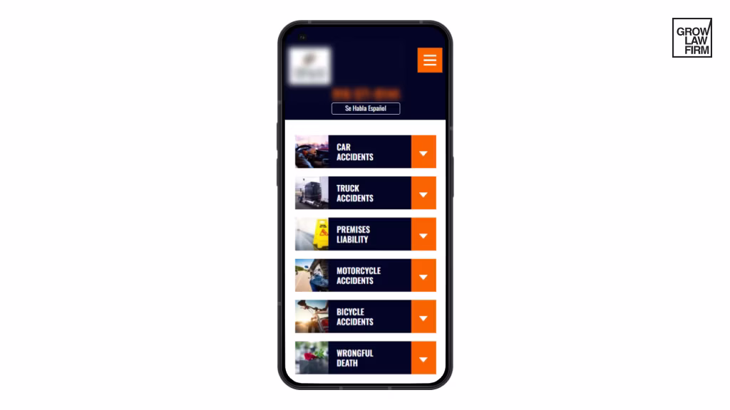
3. Optimized Navigation Menu
A cluttered or confusing navigation menu can quickly turn off potential clients and send them searching for another lawyer's website. But what can you do to optimize your website navigation menu?

Start with a simplified top-level structure focused solely on key pages. For the initial view, aim for 3-5 essential pages like ‘About,’ ‘Services,’ and ‘Contact.’ This minimal starting point allows clients to orient themselves and not get overwhelmed immediately.
Then, for additional pages, use a subtle hamburger icon—the three-line icon—to expand a pull-out menu in an overlay. This icon is a recognizable symbol for mobile navigation, providing a clean and unobtrusive menu interface while keeping the focus on your content for mobile.
On top of that, be sure important actions, like ‘Free Consultation’ buttons, are prominent and accessible in the above-the-fold space without scrolling down. This applies to headers, footers, and all prominently placed buttons.
To further streamline the navigation experience, remove extra submenus and reduce overall options. Keep the menu options concise, relevant, and aligned with the needs of your target audience.
4. Streamlined Forms
Creating streamlined forms can significantly improve the user experience and increase conversion rates for potential clients. Text fields require precise tapping - replace these with easier-to-select radio buttons and drop-downs for multiple-choice or category selections when possible. Tabs or clicks to advance are frustrating on small screens. Implement smooth auto-advancing focus between required fields so users can fill out selections without pausing.
Additionally, immediately check and notify users of errors so they can easily fix them before submitting rather than facing rejection pages. This prevents extra taps and re-entry.
To provide context and guidance, consider using floating label patterns. Instead of static labels placed above or beside form fields, floating labels appear within the field, providing context and disappearing as users input information. This pattern saves space, creates a clean design, and ensures that users always have the necessary information at their fingertips.
5. Easy-to-Read Typography
Simple typographical adjustments make all the difference when eyes strain to read on small mobile screens.
One of the first considerations is to increase the font size for improved readability. Aim for a minimum font size of 16 pixels for body copy, ensuring that text remains clear and legible on mobile phones. Larger font sizes reduce eye strain and make it easier for users to absorb information without pinching and zooming.

Pay attention to line height—the space between lines of text. Increasing the line height helps prevent text from appearing crowded and improves readability. Adequate line spacing allows users to scan and navigate content easily, enhancing the overall reading experience.
Good spacing between paragraphs is equally important. Use generous spacing between paragraphs to create visual breaks and help users understand the structure of the content. Furthermore, legibility depends on high color contrast between text and background. Opt for a color scheme that provides sufficient contrast, making the text stand out clearly.
6. Effective Call-to-Actions
Clear calls-to-action helps law firms guide users toward taking specific actions that drive conversions and facilitate meaningful interactions. Prominence is key when it comes to CTAs on desktop and mobile devices. Place your CTAs above the fold, immediately visible to users without scrolling.

Design your CTAs with "fat finger" usability in mind. Mobile users rely on their fingers to tap on buttons, so make your tap targets large and easily clickable. Ensure that the size of your buttons accommodates the average finger size, reducing the chances of accidental clicks and enhancing the user experience.
High-contrasting colors like blue against orange help buttons visually pop. Test various hues with a mobile-friendly test tool to see which attracts the eye most readily on screens.
Then, ensure that your CTAs convey the intended outcome. Use action-oriented language and be specific about the desired action, whether it's "Contact Us," "Request Consultation," or "Schedule an Appointment." Explicitly stating the purpose of the CTA helps users understand what they can expect and encourages them to engage accordingly.
When optimizing a law firm website for mobile, focus on ensuring all key content is easily accessible and readable on smaller screens.
Level Up Your Brand
Find out how much demand there is in your geographical area
Book a Free Consultation

7. Optimized Images
Visuals enhance any mobile site but can also slow down the website's load time if not optimized properly. You don't want that- you need to optimize your attorney site without sacrificing quality.
- Optimize photos by resizing them appropriately for different devices and compressing file sizes for better user experience.
- Use CSS to make images responsive. This allows images to adapt to different screen sizes automatically. Responsive images ensure your website maintains its visual integrity across various devices, from smartphones to tablets.
- Include alt text descriptions so images convey meaningful context for users who can't see them, like screen reader users.
- Implement lazy loading for images below the fold to significantly improve page loading times. WordPress users can get various lazy-loading plugins on the platform. With lazy loading, images are only loaded as the user scrolls down the page, reducing the initial load time and conserving valuable bandwidth.
This technique enhances website performance, especially on mobile devices with limited resources.
8. Minimal Pop-Ups and Interstitials
Pop-ups and interstitials can be frustrating for desktop users. Imagine how disruptive they'd be on devices with smaller screens. Refrain from using popups and overlays that obstruct the user's view or interfere with their ability to navigate your website.

If you include pop-ups or interstitials on your lawyer's website, ensure they function correctly and don't prevent users from accessing your content. Test them extensively to ensure they display correctly, are easily dismissible, and do not cause usability issues.
Moreover, it's important to eliminate popups blocking mobile device content. Mobile screens have limited space, and popups that cover the main content can be immensely disruptive. Instead, consider using non-intrusive alternatives such as banners or slide-ins that don't obstruct the primary information users seek.
9. Accelerated Load Times
Bounce rates increase significantly with slower loading times. A 5-second delay can lead to a 38% bounce rate increase. To achieve accelerated mobile pages, optimize and compress all images, videos, and other assets to reduce their file size and improve load times. There are various tools available that can help you with this process, such as ImageOptim or ShortPixel.

Lazy loading of non-critical content, such as images or videos, can also help reduce the initial load time of your webpage. This technique defers the loading of non-critical content until it's needed, allowing the critical content to load first.
Furthermore, caching assets, such as frequently accessed files, can help minimize server requests and improve load times. This technique stores frequently accessed files in a user's browser cache or a server cache, reducing the need for repeated requests to the server.

10. Using HTML5 Code
Utilizing HTML5 instead of Adobe Flash is a strategic move in optimizing mobile sites for lawyers, ensuring that the firm's website caters to the needs of mobile users. HTML5 facilitates smoother navigation and enhanced compatibility across various devices, eliminating the frustrations often associated with Flash. Its adaptability allows for the integration of interactive features, such as videos and animations, enabling lawyers to effectively communicate complex legal concepts to visitors.
Moreover, HTML5's responsiveness ensures that the website maintains its visual appeal and functionality across different screen sizes, enhancing the overall user experience.
11. Mobile-Responsive Test Tool for Lawyers
To create a great mobile site, always test your website on an actual mobile device. While online emulators can provide some insights, they cannot fully replicate the experience of viewing the website on an actual mobile screen. By testing on real devices, law firms can verify that their websites are actually mobile-responsive and provide an optimal user experience.
The Google Mobile-Friendly Test Tool is a crucial resource for lawyers looking to evaluate their law firm website's mobile usability. This user-friendly tool conducts a comprehensive mobile usability test, focusing on aspects like mobile friendliness and navigation. By analyzing the mobile page test results, lawyers can pinpoint potential issues hindering the website's performance on smaller screens.
Optimizing your site based on these insights can improve user experience and engagement, ultimately leading to increased visibility and lead generation. Want to stay competitive? Make sure your website is easy to use on your phone.

— Best Mobile Friendliness Tests for Law Firms
As we mentioned, a seamless user experience on smartphones and tablets requires regular mobile-friendliness tests. These tools analyze your website and pinpoint areas for improvement to achieve optimal mobile performance. Some top options include:
- Website Grader: HubSpot's tool provides a comprehensive assessment of mobile-friendliness, performance, SEO, and security, offering actionable recommendations for a mobile-optimized website.
- Pingdom: Provides a letter grade and score, along with plain-language explanations for performance issues. Allows you to choose your geographic region for testing.
- Bing Mobile Friendliness Test: Similar to Google's test, this one offers a pass/fail assessment and a rendering of your site on a mobile device. It provides reasons for failure, but explanations may be limited.
- PageSpeed Insights: Google's advanced tool delves deeper into performance metrics, offering detailed diagnostics and improvement suggestions. This is especially valuable for law firms with dedicated web developers.
- SiteChecker: Provides a grade and comprehensive information about site performance, including improvement recommendations for both desktop and mobile. It offers suggestions for content, coding, linking, social media, and more.
- MobiReady: This test visualizes your website's appearance on various devices and offers clear explanations of issues alongside helpful links on how to resolve them.
- WooRank: Analyzes site performance, including mobile friendliness, and assigns a score. It requires a signup to access detailed reasons behind the score. It's particularly useful for those seeking a suite of SEO tools.
- WebPageTest: This tool provides easy-to-understand summaries and in-depth technical analysis, including image optimization insights and visual representations of page loading.

Top 10 Best Mobile Optimized Law Firm Websites
These days, having a mobile-optimized website for law firms is no longer optional – it's essential. Potential clients increasingly search for legal services on their smartphones, and a seamless mobile experience can make or break their decision to contact your firm. Here's a look at 10 law firm websites that excel in mobile website optimization for lawyers, providing a user-friendly experience that converts:
1. Jim Adler & Associates

This Texas firm utilizes their signature "Tough, Smart Lawyer" tagline on their mobile site, instantly conveying their brand. Tappable phone numbers and a clear focus on results encourage quick action.
2. Wachtell Lipton

This top-tier M&A firm's mobile website design is sophisticated and efficient. Their concise content, clear calls to action, and fast load times cater superbly to on-the-go users.
3. Fish & Richardson

A leader in intellectual property law, their mobile website stands out with large, tappable elements, high-contrast design, and intuitive search functionality, making information easily discoverable.
4. Avrek Law Firm

This California-based firm's mobile website immediately highlights case results, demonstrating their track record. Their use of contrasting colors and clear typography enhances readability.
5. Quinn Emanuel Urquhart & Sullivan LLP

A litigation powerhouse, their mobile website features a modern design, prominent visuals, and easy-to-read attorney bios, making it simple for clients to connect with the right lawyer.
6. Susman Godfrey

This trial lawyer features a mobile-friendly website with a bold design, clear navigation, and a focus on results-oriented content, effectively showcasing their expertise.
7. Covington & Burling

This international firm's mobile version offers a clean and professional aesthetic. Practice area descriptions are informative yet concise, perfect for mobile browsing.
8. Weil, Gotshal & Manges

This international firm offers a mobile-friendly experience characterized by fast loading speeds, easy-to-read fonts, and a focus on key practice areas, ensuring a seamless experience for users.
9. Montlick & Associates

Their mobile website features a prominent case evaluation form, making it easy for potential clients to take the first step. Their use of icons adds visual appeal and facilitates navigation.
10. Kasowitz Benson Torres LLP

This litigation powerhouse boasts a mobile-friendly website that's both visually appealing and intuitive. Key contact information is prominently displayed, and practice areas are easy to navigate.
Convert Your Law Firm Website to Mobile-Friendly with Grow Law Firm
Clients do most of their research, review seeking, and initial engagement with service providers through smartphones and tablets. If law firm websites can't deliver a top-notch mobile experience, they risk missing out on valuable leads. From responsive design and simplified navigation to optimized images, forms, and calls-to-action - making improvements across these fundamental areas will ensure your mobile site satisfies the needs of on-the-go clientele.
If you are looking for an experienced law firm SEO company that can provide expert guidance on how to make a mobile-friendly website for lawyers and enhance your law firm's online presence, partner with a trusted digital marketing team like Grow Law Firm. We provide a comprehensive mobile makeover that improves conversions and boosts organic traffic to help you reach your revenue goals. Contact us today to start attracting more clients through an accessible, engaging mobile experience.

Compare Your Practice Instantly
Stay Ahead of the Competition!
Compare your law firm's performance to Local competitors with our instant assessment tool
Get a clear picture of your firm's performance
Boost your online presence
Compare My Firm
Compare Your Practice Instantly
Stay Ahead of the Competition!
Compare your law firm's performance to Local competitors with our instant assessment tool
Get a clear picture of your firm's performance
Boost your online presence
Compare My Firm
![49 Best Law Firm Websites: Web Design Examples [2025 Edition]](https://cdn.prod.website-files.com/66aca5d4a1f5fb14eab62a7e/6819b688251817ba49d0e3e5_66ceaf62bb3e894d1a47f199_64ccf5a954cc4e54188dc7d3_best_law_firm_websites.avif)
.svg)
.svg)

